Congratulations to Steven Kenny!!!!
I am sitting here, enjoying my favorite Christmas gift, a copy of the art book, Spectrum 19, The Best in Contemporary Fantastic Art, while sipping my morning coffee. Much to my surprise (actually, I always knew he would end up here!) on page 275, is my friend and former Middle Street Gallery mate, Steven Kenny. Actually it's his painting, "The Imposter". Good Job, Steven!
Sunday, December 30, 2012
Saturday, December 29, 2012
Stonewall Jackson Shrine

Friday, December 28, 2012
Williamsburg Christmas


We spent Christmas in Williamsburg this year. Here are two shots on Christmas Eve in the old town square at the Courthouse and Powder Magazine. There were braziers burning throughout old town to light your way. This is the crowd, all given little candles and singing carols just before the lighting of the tree. Of course, the other photo is the magnificent tree on the lawn adjacent to the magazine. Just before dark, the canons were fired repeatedly along with the firing of the muskets in front of the magazine.
Wednesday, December 26, 2012
Dianna The Huntress
I am getting ready to start a new painting, Dianna The Huntress. I have a lovely local girl (Courtney) for my model, along with her two Dobermans. I love to include animals in my Gods and Goddesses paintings. We have had our photo session and I am reviewing the photos for the pose that strikes my fancy most. At this time, I am sooooooo torn. A standing pose in a classic Greek stance, or a crouching pose with more action. I am going to spend this morning doing some thumbnails in an effort to come up with a perfect composition.
Sunday, December 23, 2012
Flora Finished
Flora is now finished. No pictures of this one, you have to come to the solo show in April to see it. After the solo showin Alexandria is over, I plan to have a few of the paintings made up into postcards and notecards. Flora is definitely one I will make into a notecard.
You are all invited to my solo show, "Everyday Gods & Goddesses" at The Art League Gallery in the Torpedo Factory Art Center, Alexandria Virginia in April.
You are all invited to my solo show, "Everyday Gods & Goddesses" at The Art League Gallery in the Torpedo Factory Art Center, Alexandria Virginia in April.
Saturday, December 22, 2012
Merry Christmas Before I Forget!
The holiday season gets so crazy, all the presents to buy and wrap, cards to send, cookies to bake, decorations to hang and the list goes on. If I don't get another posting up for a few days, I know you will understand. And, Before I forget, I want to wish everyone a Merry Christmas.
Friday, December 21, 2012
Transparent Underpainting Ruined!
I tried to continue yesterday, the two panels that I created a transparent underpainting on and I hate them now. As soon as I put opaque colors into the scene, I lost the jewel like colors that I was so happy with before. OK, so I am being very hard on myself right now. The pictures look pretty good, but I really did like the clear, bright colors better. Naturally, no photos. Guess who forgot her camera and laptop yesterday?
Tuesday, December 18, 2012
Transparent Underpainting
Saturday, December 15, 2012
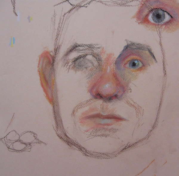
Pastel Portrait Workshop

Newtown Connecticut
I am so horrified by the killings yesterday in Newtown Connecticut. I raised my son in a time when the word pedophile was just coming into our American language and mass murders were unheard of. I never feared sending him off to school, it was a safe place. As a single working parent, school represented the other parent my son needed. Now all that is gone. As a grandmother of a beautiful little girl, how can I ever again believe she will be safe? How can any parent ever leave their child at school all day and not go insane with worry?
My heart goes out to the families in Newtown Connecticut.
My heart goes out to the families in Newtown Connecticut.
Friday, December 14, 2012
Holiday Show At Art Square and Portrait Workshop
Tonight is the opening reception for the Holiday Show at Art Square in Leesburg. I will be in my studio today and this evening for the reception. Reception hours are 5:30 til 8:00, but the studios are open along with the front gallery all day long. Art Square is located at 12 Cardinal Park Dr. just off of Route 7. Just look for the Toyota Dealer near the Rt. 7 bypass on the outskirts of town.
Tomorrow I will be teaching a portrait workshop at The Studio Frame Shop in Warrenton. Pictures will follow (if I don't forget the camera).
Tomorrow I will be teaching a portrait workshop at The Studio Frame Shop in Warrenton. Pictures will follow (if I don't forget the camera).
Wednesday, December 12, 2012
Color Notes - French Ultramarine Blue
I catagorize French Ultramarine Blue as an Almost Transparent color. It can make wonderful glazes when oily enough or can cover in an opaque manner straight from the tube if not so oily. I relied heavily on this color in my early years of portrait painting for cooling colors in the shadows of the face and I would place a pure dot of it into the iris of the eye instead of using black, which would go flat and lifeless in the eye. I have now added Phthalo Green (WHO COMES UP WITH THESE NAMES?) to my color box and use it almost exclusively for portrait work in place of French Ultramarine Blue. (But not in the eye!) Thank you to Portrait Artist Edward Reed (Ted) for showing me this wonderful green.
Back to Blue now.....French Ultramarine Blue is a must have for landscape painting. An infinite number of greens can be made with it and no northern plains sky would be complete without it. Remember I said that mixing Cadmium Red with Blue would not produce a good purple....well it will make a great muddy purple or lavendar if mixed with French Ultramarine Blue and this color mix would look just fine in a landscape painting, especially a nocturnal scene. NOW, LETS GO PAINT!
Back to Blue now.....French Ultramarine Blue is a must have for landscape painting. An infinite number of greens can be made with it and no northern plains sky would be complete without it. Remember I said that mixing Cadmium Red with Blue would not produce a good purple....well it will make a great muddy purple or lavendar if mixed with French Ultramarine Blue and this color mix would look just fine in a landscape painting, especially a nocturnal scene. NOW, LETS GO PAINT!
Monday, December 10, 2012
Color Notes - Indian Yellow
Again, a transparent color. I had never used Indian Yellow until I took a portrait class at the Art League school a few years back. To mix flesh tones, I had always used Cadmium Yellow and white with a touch of red. The results were just ok. I then learned to take a touch of Indian Yellow and mix it with white, place this on the canvas and then to come back and use a bit of Permanent Rose mixed into white, and lay that color on the canvas next to the yellow mix. Blend gently and WOW, the flesh dances and is not muddied.
FACT OR MYTH. I don't recall where I heard this or who told me, but I am sure you have heard this same thing. Indian Yellow is made from the urine of cows in India....thus the name Indian Yellow. Then a year or so ago, I read that this could not be proven by a colorist researching colors for a book. Can anyone out there definitely prove or disprove this bit of Myth? Send me info if you have it.
FACT OR MYTH. I don't recall where I heard this or who told me, but I am sure you have heard this same thing. Indian Yellow is made from the urine of cows in India....thus the name Indian Yellow. Then a year or so ago, I read that this could not be proven by a colorist researching colors for a book. Can anyone out there definitely prove or disprove this bit of Myth? Send me info if you have it.
Friday, December 7, 2012
Color Notes - Transparent Underpainting Today
I am at the Leesburg studio today. Spent yesterday getting some pet portraits ready for clients who intend them as gifts for Christmas. After a full day of concentrating on getting a likeness and doing fine details, I felt I needed a day just to play with color. So today I have set up two gessoed panels side by side and started a dyptic of an autumn scene. The photo reference is one I took down at Natural Bridge. Since I have been extolling the virtues of transparent colors, I did an underpainting on each panel using the transparent colors, Alizarin Crimson, Sap Green, and Indian Yellow. Unfortunately, I could not accomplish a reasonable sky without using some white and French Ultramarine Blue. I will photograph this underpainting when I return to this studio, since (as usual) I forgot the *^%+#@ camera.
Wednesday, December 5, 2012
Alizarin Crimson
Another of my favorite transparent colors, is Alizarin Crimson. When learning about colors, color temperature is an important property to understand about each color. Cool or Hot? Alizarin is a cool red. It is what we refer to as a bluish red. Actually, I think of it as a purple. Unlike Cadmium Red, which is a hot red, you can mix Alizarin with blues for some mighty beautiful purple results. Add a touch of white and you make pinks. Alizarin makes some very good glazes and can tone (grey) down greens. Yellow Ochre with some Alizarin and a touch of white will give you some good warm flesh color. Play around with this color, you will grow to love it as much as I do.......OH and it is also a fugitive color.
Monday, December 3, 2012
Color Notes - Sap Green
Most academic color discussions will start with the primary colors, red, blue, and yellow. Aha! I am no scholar and what I know about color, came from sitting down and getting dirty. I want to talk about Sap Green today, because it is the one color that I would choose to have with me if I were stranded on a desert island.
No colors give me more trouble than the greens. I simply don't have an eye for green. I have no trouble when using reds or yellows, but greens never look natural in my works, no matter how hard I try. When I see plein air paintings by some of my contemporaries, I always marvel at how realistic or natural their greens are. ( MENTAL NOTE.....I will conquer green this year.)
OK, Sap Green. This green is usually nice and juicy,straight from the tube It is a transparent color and makes wonderful glazes. It is one of the few greens that I find looks natural straight from the tube. Now, mix a little Indian Yellow to it and you have a super natural looking green. I have started using this green in most of all my green mixes. Now, take some Alizarin Crimson (another transparent color) and add that to Sap Green and you will have a wonderful rich brown to put into your landscapes. If you have a bright red and need to reduce it's intensity, just add a bit of Sap Green to grey it down. The downside to Sap Green is that it is a fugitive color, or so I am told by the scholars. I doubt I will live long enough to prove or disprove this, so I still want my Sap Green.
Sunday, December 2, 2012
Brand Name Snobbery
The very first thing I tell students taking my beginners class is, "Buy one brand and stick to it until you know what you are doing." I explain to them that each manufacturer has different formulas for their colors. So a Cadmium Red for one brand will be very different from another brand. In the early days, I once started a landscape sky with Grumbacher's cerulean blue, but ran short of it and had to run out and purchase more. OOOPS, no Grumbacher available, so I purcased some Brand X cerulean blue and home I went. Those two blues were nothing alike, even though they had the same name and there was no way they were gonna match up. Guess who had to repaint that entire sky?
As for workability, one was nice and oily and the other so dry and stiff, I wanted to make pottery with it.
Now I am no snob when it comes to buying art supplies, but I do have definite likes and dislikes. I won't give anyone an endorsement in this blog, since they aren't paying me for an endorsement, but if you would like to know my favorites list, send me an e-mail and I will be happy to give you my list of faves.......also, the brands I won't touch.
OK, GO PAINT ALREADY!
Saturday, December 1, 2012
Color Notes
I think that you are ready for some posts that are more art related, rather than personal. OK! In my next few blog posts, I will give you some observations I have about oil colors and how I use them. I am by no stretch of the imagination, an expert, but I do have some basic knowledge I would like to pass on for you beginners out there.
Lets start with my latest color discovery.....Sepia. I heard about this color at the Illustration Master Class that I attended the last two years. It was on our supply list, so I bought it. Never used it at the class, but when I returned home, I played around with it. WOW!, a great color for painting the ocean. I recently did a stormy sea with a huge wave rising. I used Titanium White, Sepia and Cerulean Blue. Blending and mixing various amounts gave me a wide range of color for the ocean and wave. I even took a bit of Cadmium Scarlet and made a pale pink to add to the tops of the foam on the waves.(This pink trick I learned by studying the painting of Niagara Falls, by Frederick Church at the Corcoran in DC). Sepia is a bit transparent, which I love. I really lean towards the transparent colors and glazing. Sepia also works wonderfully to tone down my brighter colors and works well in my dark backgrounds, with Sap Green and Alizarin Crimson. I am going to try doing an entire under painting (grisielle) for my next painting and then glaze color over it. I will report back in a future blog post.
Lets start with my latest color discovery.....Sepia. I heard about this color at the Illustration Master Class that I attended the last two years. It was on our supply list, so I bought it. Never used it at the class, but when I returned home, I played around with it. WOW!, a great color for painting the ocean. I recently did a stormy sea with a huge wave rising. I used Titanium White, Sepia and Cerulean Blue. Blending and mixing various amounts gave me a wide range of color for the ocean and wave. I even took a bit of Cadmium Scarlet and made a pale pink to add to the tops of the foam on the waves.(This pink trick I learned by studying the painting of Niagara Falls, by Frederick Church at the Corcoran in DC). Sepia is a bit transparent, which I love. I really lean towards the transparent colors and glazing. Sepia also works wonderfully to tone down my brighter colors and works well in my dark backgrounds, with Sap Green and Alizarin Crimson. I am going to try doing an entire under painting (grisielle) for my next painting and then glaze color over it. I will report back in a future blog post.
Subscribe to:
Posts (Atom)
